

About 3 months ago, when I first started writing on Substack, one of my first posts was about shooting film on a budget. I’ve been telling myself that I’d like to write a follow-up, specifically on negative conversion. There’s a couple of reasons for this:
I want to share what I’ve figured out re: workflow/etc., in the hopes that someone else might get some value out of it.
Much more importantly, use Darktable & don’t pay* for Lightroom. Adobe is ubiquitous, but this is absolutely doable with free & open source alternatives. The Darktable UI isn’t as intuitive, but there’s really only a few things that are needed to make this work.
I won’t go into the scanning process, because I assume that’s straightforward enough. But if it’d be useful for someone else, maybe I’ll cover that in a future post (3 months from now of course).
*yes, you can just pirate Lightroom, I guess
Here’s something from a roll I scanned today:
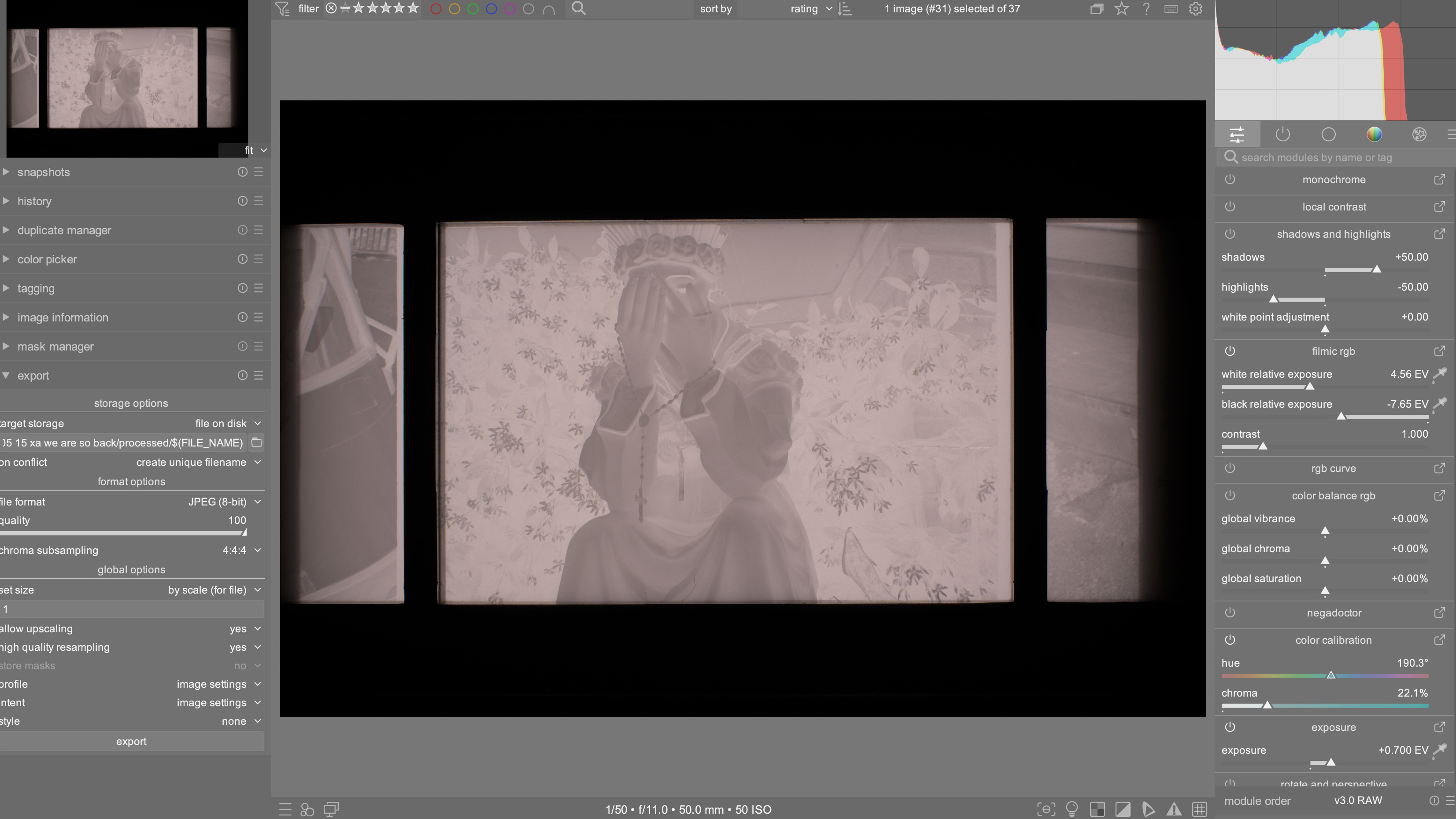
Right off the bat, there’s a problem: this isn’t monochrome. When I import RAWs, even if I shot them in monochrome with my Sony A7R3, Darktable insists on importing them as color images. Easy enough to deal with: just turn on the monochrome module from the column on the right.
Darktable organizes everything into what it calls modules. The first panel is the quick access panel; as this is customizable, yours will look different. I organized mine to have some of my most frequently-used modules, and since monochrome is always the first one I use, I put it at the top. If you don’t see it, you can also just search for it using the search bar.

Much better.
Next order of business is to crop out the rest of the negative carrier. Because of my lens & macro rings combination, I’m not able to get close enough to use the full sensor; it’s not heartbreaking for me, but it’d be nice to upgrade that. Nevertheless, to access the crop module, either search for it or click the circle button labeled “base.”

Clicking the power button turns on the module; clicking the module name open up the settings, which also gives you access to different aspect ratios, etc. I won’t mess with that, and I’ll just leave it at 3:2.

The eagle-eyed among you might have already noticed the hair along the bottom of the frame. Don’t be like me: be much neater with your negatives.
Last thing to do before conversion is to turn off filmic RGB. Essentially it simulates how film behaves. But we’re already using film, so it’s redundant. (You can leave it on & nothing bad will happen, but I prefer not bothering with it for this.)

Not a huge difference, but I can already see a little more contrast.
We now want to use the negadoctor module for negative conversion.

By default, it’s set for color film. We want to switch that to black & white.

There it is! It looks like butt, though: it’s gray & washed out, and there’s virtually no contrast. There are a few things we can do in negadoctor to deal with this:

First I turn the exposure bias to 0, then I bring the max dynamic range up to where the whites look a bit brighter. I’ll then play around with the min dynamic range until I start to get the blacks closer to what I want. Usually I go back & forth between changing the min & max dynamic ranges; play around until the contrast starts to look a bit better. There’s more that’ll happen after this, so don’t worry about getting it perfect with these 2 sliders.
Here’s what I consider a decent result at this point. I’m especially looking for more richness in the shadows but still keeping a decent bit of detail.

The next step is to adjust the print properties. This simulates how an enlarger behaves. It’s also a feature I neglected using for a long time, but it’s super useful.

First, I bring up the exposure adjustment until I get a little more shadow detail while still keeping reasonably good blacks:

I’ll then bring up the gamma & density correction until the contrast starts to look right. This varies from picture to picture; here’s what works for me for this one.

If the highlights start to get a little too cooked, bringing down the specular highlights can help too.
The contrast is almost there, but it’s not quite what I want, so I’ll play with the RGB curves. Again, search for it & switch it on. This is what it looks like after applying a slight curve:

This is probably a little heavy handed, but it’s my birthday and I get to decide what movie we’re watching.
The last thing I want to add is a slight vignette. Something that really bothered me for a long time was that the edges & corners were always brighter than the center of the image. Whether it’s due to the macro rings or the negative carrier, I have no idea. The workaround I’ve found has been to add a vignette to counter it, but with a slight tweak. Just like before, search for the vignetting module & turn it on:

Then click the power button, to show only active modules:

Darktable has a default order for its modules. A stack, for my programming/Magic: the Gathering nerds. Modules are applied from bottom to top: in this case, “white balance,” then “highlight reconstruction,” then “demosaic,” and so on. While this order is usually fine, you can also move things around & change the module order. On Mac OS, you do this by holding control+shift, then clicking & dragging a module. You want to move the vignetting module to be directly above the negadoctor module, so that the vignette is applied after negative conversion but before curves:

From here, I tweak the vignette radius & brightness until the corners feel more even, without being too intrusive. This is far from an exact science & is done to taste. I suggest doing a lot of A/B-ing, and seeing what the image looks like with the vignette on & off. To side-by-side them, here is how this looks with & without:


Notice that I’m also moving the center of the vignette around. Moving this, in combination with large radiuses (radii? English is stupid), yields more natural results.
The last module that I like to use is local contrast. This can be found from the quick access panel. It does something between sharpening & contrast, and works well for adding a last little bit of punch. Or spice. You pick the metaphor that feels right for you.

At this point I’m pretty happy with the results, so I’ll export it & do more tweaking in GIMP**. This generally means doing a final levels tweak & using the Heal tool to fix up any big dust/scratches/etc. In this case I notice there’s some kind of scratch on the right side of the image; the emulsion itself got scratched, either in the camera or loading the film onto the developing reel.
**normally I would actually use Photoshop here, but I decided to stick to GIMP, in keeping with the open-source theme & because I’ve been meaning to see how GIMP’s Heal tool behaves. I’m pleasantly surprised!
After all is said and done, here’s the final result:

It ain’t much, but it’s honest work.
This made want to revisit Darktable. I got desperate with it and I switched quickly to Lightroom 😆.
As a workflow, this seems really cool and actually fairly intuitive to me, coming from games development. Gonna have to check it out myself, thanks for the comprehensive breakdown, homey!